MarieLaktia – Case Study
Client: MarieLaktia
Project: Branding identity, brand collateral, marketing assets, social media
Role: Brand designer
Agency/Company: Freelance
Year: 2024
Tools: Adobe Illustrator, Adobe InDesign, Adobe Photoshop
Project Overview:
MarieLaktia is a personal brand created for a breastfeeding guidance practitioner who provides lactation consulting and education for new mothers. The brand was developed to support her launch as an independent consultant offering services primarily through online platforms such as social media and web-based consultations.
I was responsible for creating the brand identity from the ground up, developing a logo suite and visual system that would establish a warm, trustworthy presence while allowing the brand to grow as the practitioner expands her services and educational programs.
The Challenge:
Because the brand represents a single practitioner, the identity needed to feel personal, nurturing, and approachable while still maintaining the professionalism expected in a healthcare-related service. It also needed to work effectively in digital environments where most of the client interaction and content sharing takes place.
Additionally, the brand was designed with long-term growth in mind, supporting the practitioner’s goal of expanding her platform to educate and train nurses or midwives in breastfeeding guidance.
Role & Process:
I worked as the freelance brand designer within a marketing team responsible for the overall brand strategy and client communication. My role focused on translating the brand concept into a visual identity system, including logo design, typography hierarchy, color palette, and brand guidelines.
The process focused on creating a symbol that could communicate the essence of the service in a simple and recognizable way while remaining warm and approachable. From this concept, I built a flexible identity system including logo variations, typography, and a color palette designed to support the brand across digital platforms.
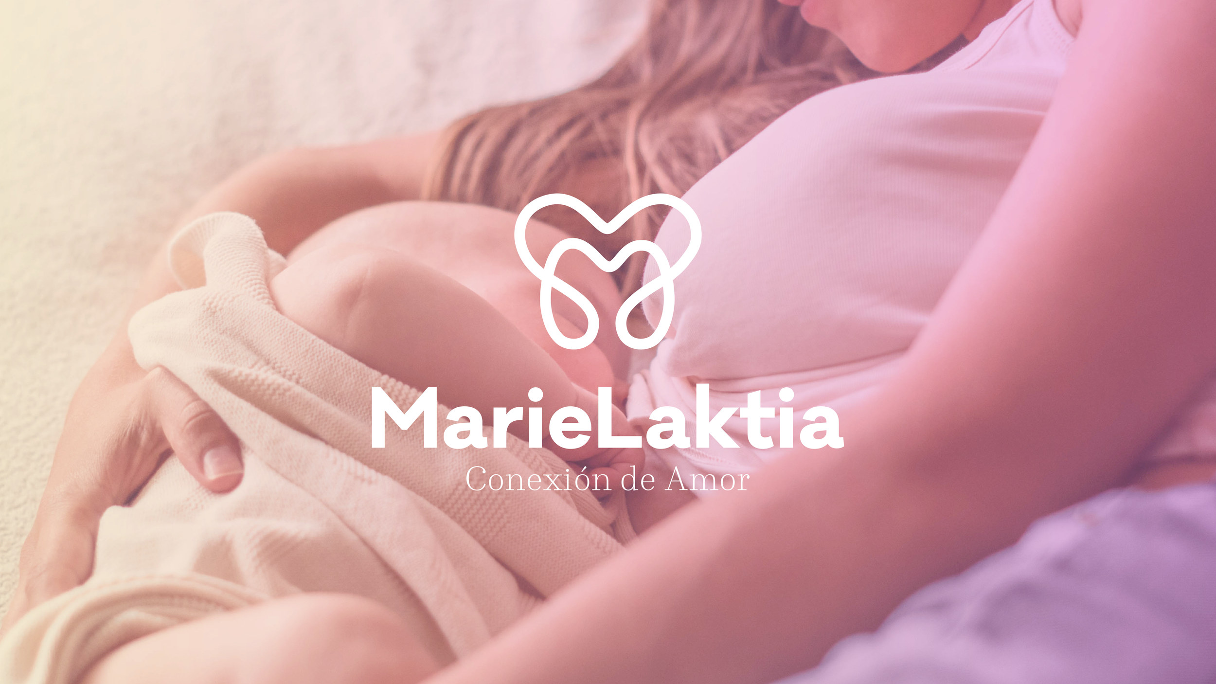
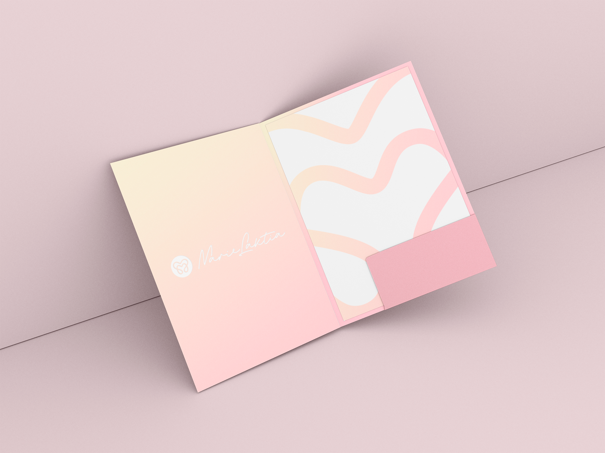
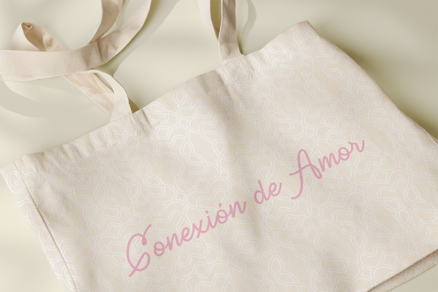
The broader identity system was built around soft colors and friendly typography designed to communicate care, warmth, and trust while maintaining a clean and professional appearance suitable for digital platforms.
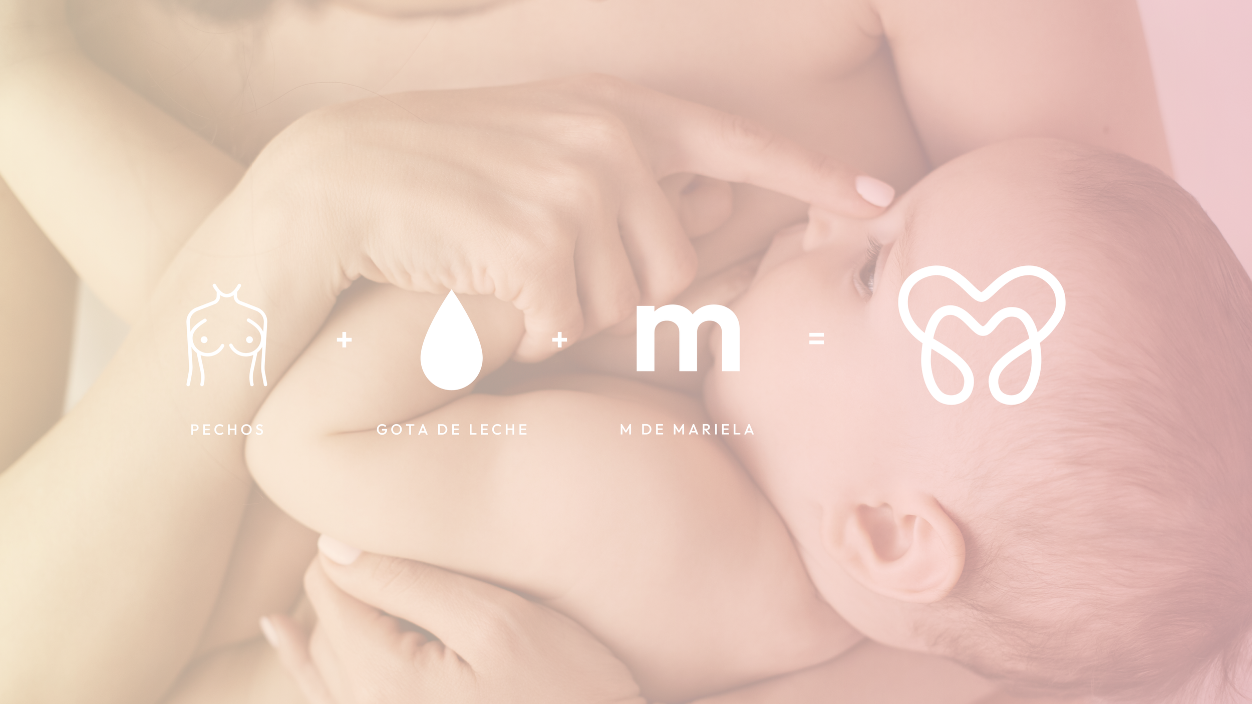

The logo symbol combines several visual references into a single, simple mark. The central shape forms the letter “M”, representing the practitioner’s name, Mariela. The curved elements also resemble milk drops flowing from the breast, directly referencing breastfeeding support. At the same time, the overall silhouette subtly evokes a heart shape, reinforcing the themes of care, nurturing, and compassion that define the service.
Deliverables:
Brand Identity
Primary logo
Secondary logo variations
Icon / logo mark
Visual System
Color palette & gradient system
Repeatable pattern
Typography system
Mini brandbook with guidelines
Brand Applications
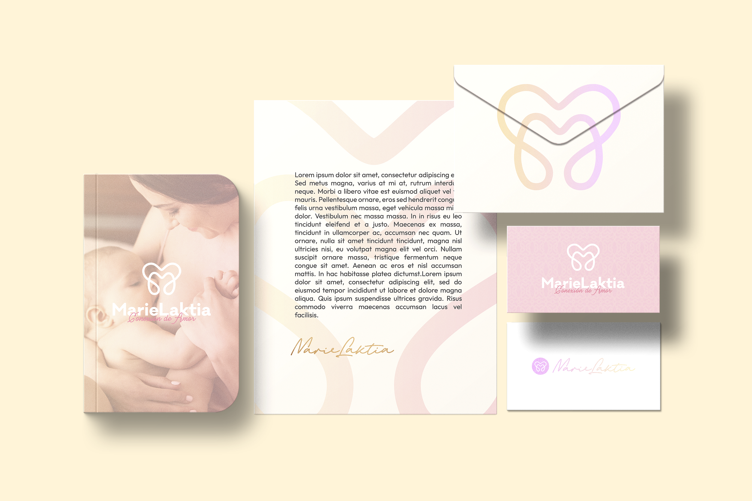
Business cards
Stationery system
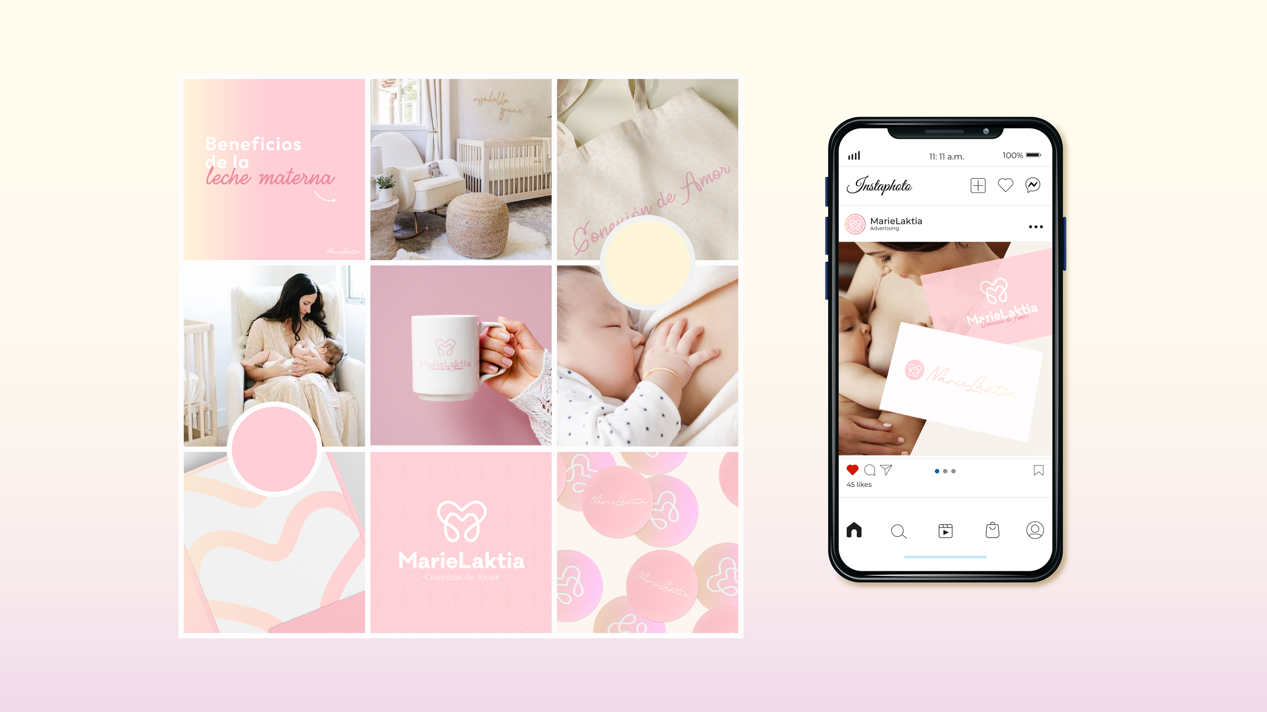
Tote bags & mugs (promotional items)
Social media branding
Digital assets for online presence